
In the last two posts, I described how we could generalize the notion of “tokens” that we first saw when analyzing non-numeric census data, to time series. In this context, a token is a short snippet from a time series that is very similar to a lot of snippets of the same length from other time series. This week, we’ll generalize the idea further from one-dimensional time series to two-dimensional images/pictures.
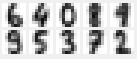
Computers store images as two-dimensional arrays of pixel colors. The images that we’re going to look at come from the handwritten digits data set on the UCI Machine Learning Repository. The file optdigits.tra contains 3,823 images of hand written digits collected from 30 different people. (The test set optdigits.tes contains digits written by anouther 13 people, but I won’t use that in this post.) These are grey-scale images, so the color of each pixel is determined by a number. In this case, the numbers range from 0 (for white) to 16 (for black). Numbers in between represent different shades of grey.
Each line in the file is a sequence of comma-separated numbers, with the last number recording which digit the picture represents. Each image is 8 pixels by 8 pixels, so there are 64 numbers in each line, plus one for the label for a total of 65. Since the data is entirely numeric, we can load it using scipy’s loadtxt function. Here’s the code that loads the file, then splits it into data and labels:
data = scipy.loadtxt("optdigits.tra", delimiter=',')
labels = data[:,-1]
data = data[:,:-1]
Note that each line is a sequence of numbers rather than an array. The array has been converted to a sequence by listing the entries in each row, one after the other. We can convert this sequence back into an array by noting that the pixel at postion (x,y) is represented by the number at position (y * 8 + x) in the sequence. Here’s what we get when we draw the first 25 images of each digit.
 I drew this using the python Tkinter package, and you can download the code from the Shape of Data github page. All the images in this post were made using the script loadDigits.py.
Since each row is a sequence of numbers, we can think of this sequence as a time series, but replacing “time” with the x-coordinate. The set of rows is, in turn, similar to a time series but with the input at each time being a row, rather than a single number. (Recall that we allowed each input to be a vector rather than a single number when we started working with time series.) We can thus think of each image as a vector by just putting all the rows next to each other. In other words, we want to think of the sequence of 64 numbers that define each digit image as the coordinates of a 64-dimensional vector.
Because each digit image is the same size, the resulting vectors are all the same dimension and we can treat them like any other data vectors and run the sorts of algorithms that we’ve seen in past posts. If we were looking at images of different sizes, we could break them down into tokens, like we did with time series. However, rather than taking snippets from the sequence of numbers that make up each image, which would give us part of an entire row, or possibly a few consecutive rows, we would cut out rectangular windows of the same size from the different images. In fact, it’s often useful to do this with images that are complicated and made up of multiple elements, even if all your images are the same size.
For example, if you want to create system that determines whether or not an image contains a person, you could cut out overlapping windows of different sizes and compare them to images that you know contain people (and images that don’t). Each comparison images (the tokens) will be cropped so that the person is the only thing in the image. This is also very closed to the idea behind the convolutional neural networks that have recently proved very effective at image recognition. I plan to describe this sort of approach in a future post, but for now, I want to focus on using simple images as vectors.
In particular, notice that each digit image is relatively simple, containing a single element that fills up the entire image. So I want to try and get an idea of how well it works to think of the digit images as vectors in a 64-dimensional data space, and I’m going to focus on the K-means algorithm.
Recall that the K-means algorithm works by partitioning the data set into a number of smaller sets, each of which is defined by its centroid or center of mass. The centroid of a set of data points/vectors is essentially their average: It’s the data point that we get by adding them all together (i.e. adding the numbers in corresponding dimensions) and then dividing by the number of vectors.
 If we do this with two data points then, geometrically, the average vector is the midpoint of the line segment between the two points, as on the right. If we do this with images, then the resulting image will look like a double exposure: It’s what we get by lightening the two images, then placing one on top of each other, so that the points where the images overlap are darker. This is shown with the images of the digits 1 and 2 in the bottom half of the picture.
If we take an average of a larger number of points, the resulting image will look like what we would get by repeating this process with all of them. If we only use a small number of images, we should still be able to make out the individual ones. But what happens when the number of images gets bigger? Below is what we get from averaging consecutive blocks of images in the digits data set. Each of the images shown below is the average of 30 consecutive images from the data set. The digits are saved in an arbitrary order, so lots of different digits go into each image.

Some of the composite images vaguely look like 8s, since these are the places where digits are most commonly dark. (This is essentially the same reason that digital clocks are made up of 8s.) For the most part, these images are just a blurry mess, but that shouldn’t be surprising; The space of digit images has a complicated, nonlinear structure, that surrounds its centroid (which is roughly approximated by each of these centroids) even though most of the data points are nowhere near the centroid. The same thing would happen if we sampled points uniformly from a circle, though the structure here is much more complex than that.
 We’ll have better luck if we take the average of images that are already similar. For example, for each digit, we can take the average of all the 0s, then the average of all the 1s and so on. The results of this are shown on the right, and while the images are still a bit blurry, they are discernible as the 10 digits. Notice that the 4s in the original images differ a lot in the height of the horizontal bar. You can see that the 4 is a sort of compromise between all of these, with grey at each height, though a darker grey in the most popular range of heights.
 The really interesting question is whether the structure of the images in the data space represents the differences that our eyes see between the digits. For example, lets run K-means on all the images, with 10 centroids. The images defined by the resulting centroids are shown on the right. You can see that K-means has roughly picked out the ten digits, though it seems to have gotten a little confused. For example, the centroid in the top left corner seems to be made of mostly 1s, but some of the 4s with the small, high loop thrown in. The 8 to the left of it seems to have some issues too – its loops are not as well defined, so it must have some other images (maybe the thick 1s) mixed in there. Still, it’s not bad for running an off-the-shelf algorthm like K-means that has no idea what sort of data it’s working on.
The reason for the mistakes that K-means makes is that some of the numbers, particularly the 4s, come in different variants: Some of the 4s are closed and some are open. Some of the 7s have cross bars and some don’t. Some of the 1s have serifs and some don’t. So the set of data points defined by the images corresponding to each digit do not form a simple Gaussian blob, which is more or less what K-means looks for.
We can improve things a little by running K-means with more than ten centroids. Below are the centroid images from running K-means with 50 centroids:

In this run, we end up with multiple centroids for each digit, most of whichrepresent the different variants of the digit. From the geometric perspective, the different centroids define multiple Voronoi cells that represent the part of the data space corresponding to each digit. So this makes it possible to represent more complicated distributions in the data space than just simple polyhedra/Gaussian blobs.
The centroids that we get this time still aren’t perfect. For example, the image in the lower row that’s below the first six in the top row looks like it may still be a combination of 8s and the thick variant of 1s. (Note that if you run the code yourself, you’ll get different images, since K-means starts with randomly seeded centroids.)
The main take-away from all this is that by treating (relatively simple) images as vectors in this way, the geometric techniques that we’ve discussed for general data types work pretty much the way we would want them to. As I mentioned above, for more complex images with multiple elements, we would need to cut each image into smaller “token” images, in analogy with the methods in the previous case studies for dealing with text data and time series. But that will have to wait for a future post.

Pingback: Case Study 6: Digital images | Ragnarok Connection
Pingback: Case Research 6: Digital photographs | Ragnarok Connection
Pingback: Convolutional neural networks | The Shape of Data